Lab Report #3: Tableau
Introduction
For this lab experimentation with Tableau, I returned to the Voyages Trans-Atlantic Slave Trade Database. I wrote about this online tool for Digital Humanities last spring, and the evaluation is posted on my blog. There are 34,946 records in the “List of voyages”, ranging from 1514 to 1866. The website enables you to create visualizations, but you can also create and download custom tables.
Materials
- Tableau Public program
- Voyages data file
Method
1. Searching the Voyages database, I selected the option to “Configure columns”, which allowed me to choose the variables for my columns. I selected several quantitative and qualitative variables for experimentation in class, and saved the file.
2. In class I uploaded the file for use in Tableau, but it was hard to work with initially because the field names in the Voyages file were in cryptic shorthand. I got good looking visualizations, but they are difficult to interpret.

3. At home I decided to go through all of the steps more purposefully, so this time I downloaded a new file from Voyages and I immediately renamed the columns with clear titles.
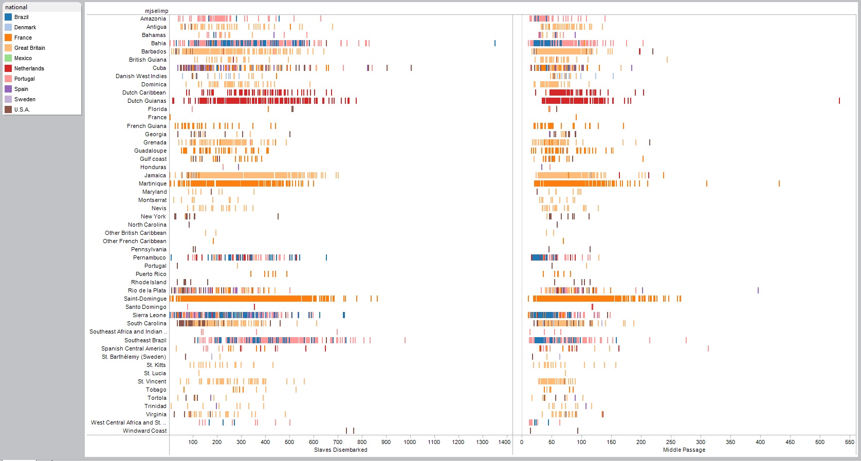
4. I decided to visualize African resistance during Middle Passage, so I filtered my data to only the records with this information.
5. I create a scatterplot where the marker colors reflect the regions that the slaves come from, and their size reflects the number of slaves that embarked from that area. On this visualization it is hard to interpret any trends because both of the axes contained categorical data.
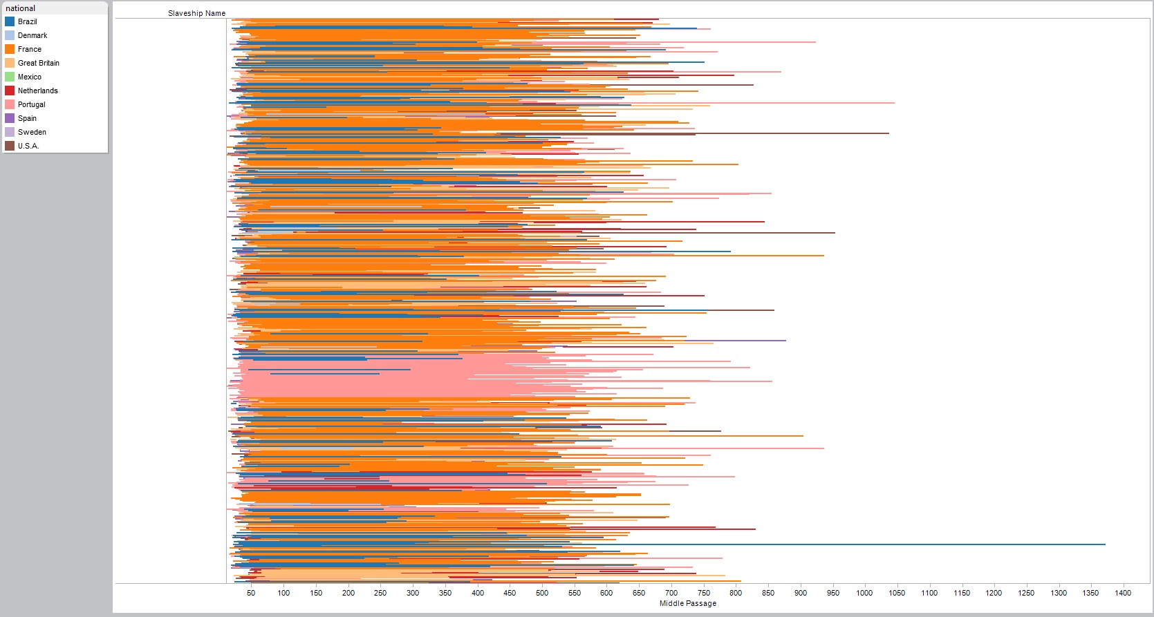
6. I massaged it so the number of days for the length of Middle Passage is one of the variables, and I swapped the rows and columns so time series data could be read from left to right.
Results/Discussion
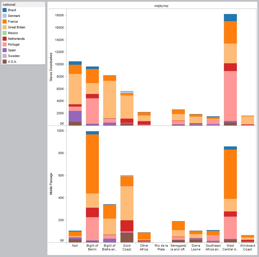
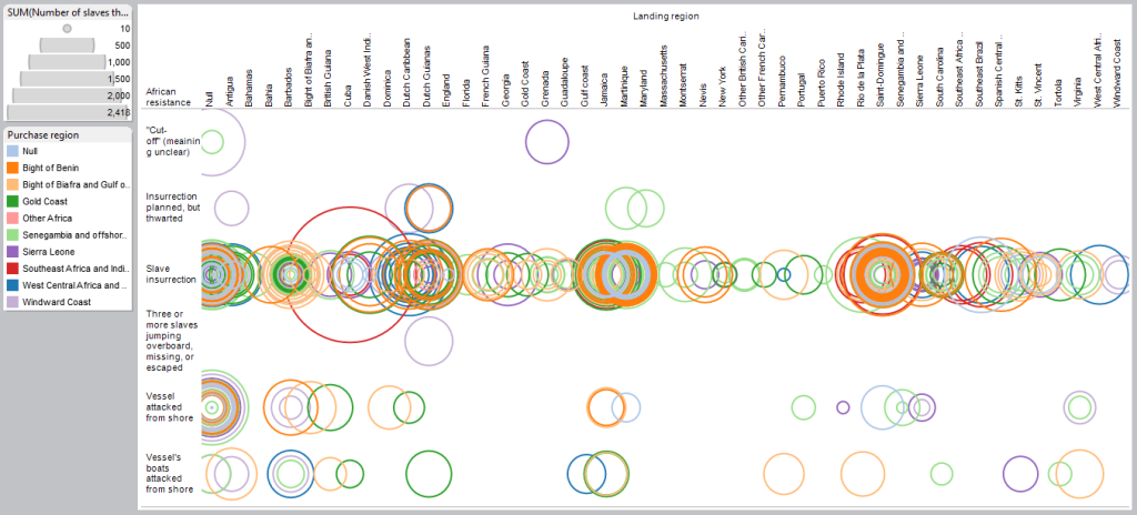 This visualization shows the types of resistance on the vertical axis, and the region where the ship landed on the horizontal axis. This shows that, of the ships that experienced African resistance, the main parties that tried it were from Benin, although there were several large groups from Southeast Africa that pulled off an insurrection.
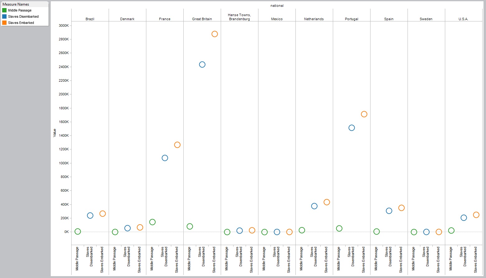
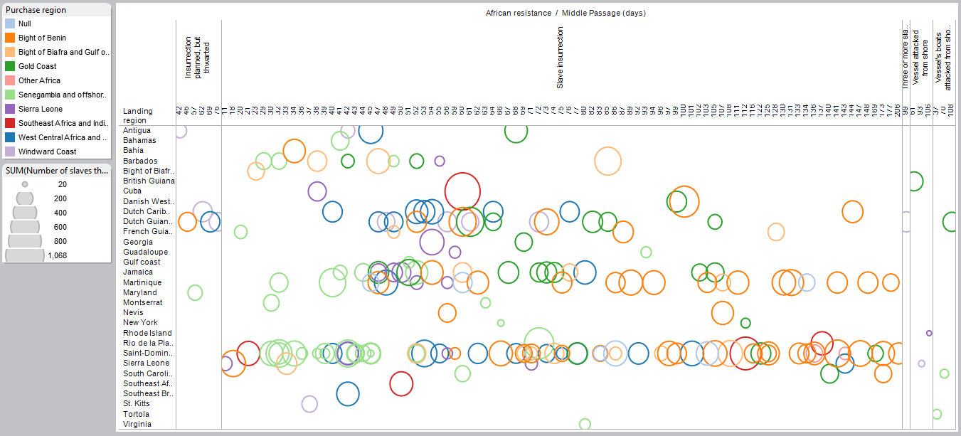 This visualization is easier to interpret because the time-series data gives it order. Looking at the category for slave insurrections in particular, you can hypothesize that incidents of resistance took place with groups of 200-400 slaves from Senegambia, and they tended to have a shorter Middle Passage, while the similar sized groups of slaves taken from Benin resisted while on the ocean for voyages that took two to six months. The cluster of dark green and dark blue indicates that slaves from West Central Africa and Benin that insurrected experienced two to three month voyages. It also seems that the largest insurrection occurred during a 60 day voyage with a group of ~1000 slaves en route from Southeast Africa to Cuba.
Future Directions
This visualization gives a better foundation for analysis than the ones I created in class, but I would like to play with it more and work with the data for the female slaves. Unfortunately it doesn’t seem appropriate to filter for this, because the records that remain might not be a good reflection of the whole data set. Instead, I will upload and play with my data from the Quilt Index. I have fewer than 1000 rows of quilts, but I can get more data if I expand my search parameters. Thus far I have been trying to focus on Gracie Mitchell’s 22 patterns identified in 1938, but I would like to work with all of the quilt data for the 19th century for my final project, and this will help me develop a heat map. I will definitely be playing with Tableau more in the coming weeks.